Clarifi's Brand
The Background and Constraints
The project began with an ambitious goal: to reimagine how artificial intelligence could make health data feel personal, trustworthy, and empowering rather than clinical or intimidating. The product team wanted a brand and visual system that could communicate the intelligence of AI while still feeling approachable and human.
The original brand, Xyramid, embodied the opposite of those goals. Its name was difficult to pronounce and spell, and its sharp, futuristic visuals created an impression of cold, inaccessible technology. Users described it as “empty” and “futuristic,” which posed a major barrier for a product asking people to share sensitive health information.
Rebranding was not just a visual exercise; it was essential to building credibility and trust.
Hard Constraints:
• Remain flexible enough to represent dynamic, data driven behavior without losing legibility at small sizes.
• Work seamlessly across both digital and physical touchpoints, including app icons, dashboards, and wearable integrations.
• Align with healthcare privacy and accessibility standards, ensuring clarity and contrast for all users.
• Convey innovation without leaning too far into “tech” aesthetics that might alienate nontechnical audiences.
• Use blue and orange in the final brand, because they had already purchased all of their office swag and decor.
These boundaries guided every design decision, ensuring the final system was not only visually engaging but also scalable, accessible, and rooted in user trust.

The Research and Problem
Xyramid set out to revolutionize healthcare applications by using AI to help people detect health anomalies early.
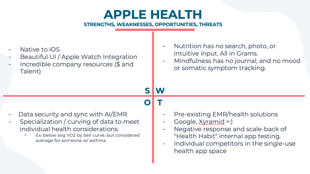
However, the brand struggled to gain user trust. The name Xyramid was hard to pronounce and remember, and the overly technical aesthetic created emotional distance; a critical issue for a product that asks users to share personal health data.

To better understand what builds or erodes trust in this space, I conducted a comparative analysis of existing health aggregation applications, including platforms such as Apple Health, MyChart, and Google Fit.

Research Insights
Familiarity builds confidence: Users tend to trust interfaces that use soft, humanistic visuals rather than cold, data-heavy designs.
Transparency matters: Clear communication around data use and security directly influences a user’s willingness to connect their health records.
Empathy differentiates: Applications that use approachable colors, simple language, and conversational tone feel safer and more “human.”
These findings confirmed that trust was a huge barrier with Clarifi. The brand needed a total transformation to align its visual and verbal language with human values of clarity, warmth, and care.
Design Approach and Outcomes
To address the trust and clarity issues uncovered in research, I developed a new brand identity and visual system under the name Clarifi Technologies.
The goal was to create a brand that felt human, intelligent, and optimistic; qualities essential for a company asking users to share their personal health data.
Design Approach
I moved away from the cold, overly technical aesthetic of the previous brand (Xyramid) and introduced:
Organic, human-centered shapes to convey approachability and warmth.
A vibrant, uplifting color palette that communicates vitality and optimism.
Simplified, friendly typography to enhance readability and build trust.
Wordmark Outcome
The new identity makes Clarifi’s mission: “to clarify and make sense of health insights through AI” immediately clear. The brand now feels approachable, transparent, and aligned with its purpose, successfully bridging the gap between technology and human wellness.
The Logomark Outcome
The logomark and Claire herself isn’t simply a circle because it looks pleasing or fits neatly into a profile photo. Its form is grounded in meaning.
Claire is visualized as a living neural network, a system often represented as a sphere of interconnected lines and nodes. This concept translates the intelligence and adaptability of AI into a human-centered visual language.
To reinforce this, we designed the logo to evolve dynamically with each user’s personal health data. Over time, Claire’s shape and color subtly shift within defined bounds, creating a visual fingerprint unique to every individual.
Two users might compare their versions of Claire and instantly recognize that their health patterns and outcomes differ, expressed purely through the changing geometry and hue of their personal AI.
Example variables influencing logo adaptation:
• Activity levels
• Heart rate variability
• Sleep quality
• Stress indicators
• Nutritional balance

Design Advisor: Ty Lettau


